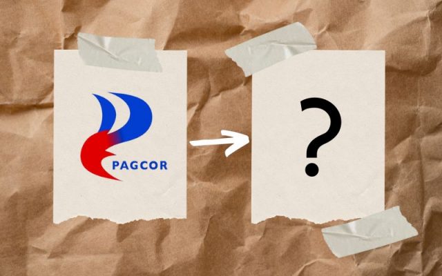
The Philippine Amusement and Gaming Corp, a government enterprise, took a risk in switching its logo to something that reminded people of a certain fuel company.
As the logo gained mixed reactions, Filipino graphic designers took the chance to pitch their own versions of PAGCOR’s logo redesign.
Most of the concepts retain the blue-and-red color scheme and reshape the stylized letter P.
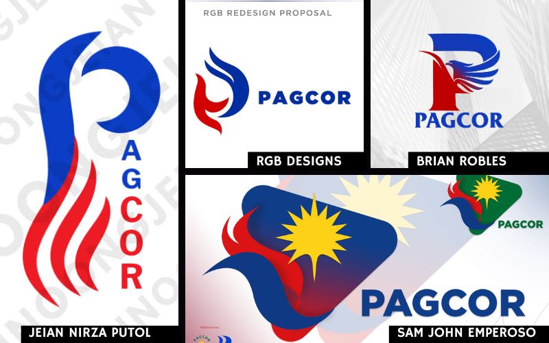
Some designers even rendered the pitches for real-life use, such as on a building facade and on notepads.
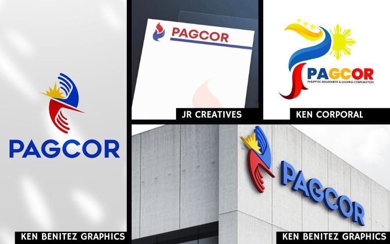
Comments on Ken Benitez Graphics’ pitch that imagines the new branding on a building, for one, reference the P3-million price tag of the scoffed-at official logo by winning bidder Printplus Graphic Services.
“Mas worth P3-M ‘to, boss,” the commenter posted under Ken Benitez’s redesign pitch.
Behind that pricey logo
A government disclosure indicates that the logo redesign project cost PAGCOR a total of P3,035,714.28.
Francisco “Dopy” Doplon of Printplus Graphic Services, the former president of the Design Agencies Association of the Philippines and the mind behind the official redesign, had designed logos for the Cultural Center of the Philippines’ 40th Anniversary, University of Santo Tomas’ 400 years Tongues of Fire Logo, Metrobank Foundation, All Day Supermarket, and many others.
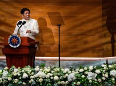
Doplon’s logo was unveiled on July 11 in the presence of President Ferdinand Marcos Jr. and First Lady Liza Araneta-Marcos.
Over the past four decades, PAGCOR has been represented by an old logo depicting a green hand holding a symbolic light.
— reports by Sheila May Balagan


