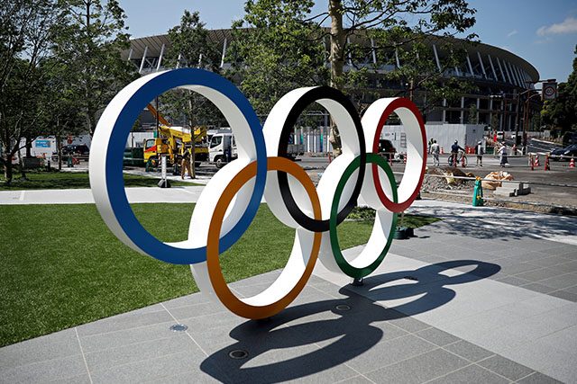
An alleged emblem for the 2020 Tokyo Olympics is making the rounds on the internet and prompting some Filipinos to recall the highly-criticized logo of another multi-sport event close to home.
A Reddit user shared what they perceived to be the logo to be used for the Olympics and wrote, “Sino na nga nag-design (ng) logo ng 2019 Southeast Asian Games?”
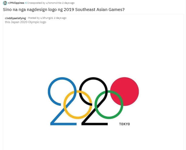
Others praised the alleged logo’s design compared to the one presented by the 2019 SEA Games Committee last February.
“Simplistic and clean, very nice,” a Reddit user wrote.
“This is how you do the circles,” another user commented, referencing the 2019 SEA Games’ logo that consists of circles forming a shape of the Philippines.
RELATED: The Logo of the Rings: 2019 SEA Games committee explains logo’s meaning again
It is to be noted, however, that the logo on Reddit was simply an uncommissioned concept of a designer and not the official one used by the International Olympic Committee for the event.
#lettering Idea for @tokyo2020 #MeAndMyPen #Olmpics #Tokyo #2020 #Tokyo2020 https://t.co/aCs13sr78I pic.twitter.com/0CWbo6UY5o
— Daren Newman (@DarenNewman) June 19, 2019
“I just put it out there on my Instagram feed expecting it to just get lost in the sea of other posts!” Daren Newman, the designer, shared in an interview before.
“But the opposite happened and it has since gone a bit bonkers!” he continued.
The official logo of the 2020 Tokyo Olympics is composed of rectangular shapes with three varieties that form a circular figure.
Designed by Asao Tokolo, it is called the “harmonized chequered emblem” which references “ichimatsu moyo,” a chequered pattern popular in the Japanese Edo period.
According to the website of the 2020 Tokyo Olympics, the chequered design “in the traditional Japanese color of indigo blue expresses a refined elegance and sophistication that exemplifies Japan.”
“Composed of three varieties of rectangular shapes, the design represents different countries, cultures and ways of thinking. It incorporates the message of ‘unity in diversity,'” it added.
The 2020 Tokyo Olympics is an upcoming international multi-sport event scheduled to take place in the capital of Japan from July 24 to August 9.
A total of 206 countries are expected to participate, with more than 11,000 athletes all over which includes the Philippines’ own champion weightlifter Hidilyn Diaz.
Remembering the SEA Games logo
The official logo for the Philippine-hosted 2019 SEA Games has been highly criticized by Filipinos even during its proposal for its simplistic design.
Incoming Taguig Rep. Alan Cayetano, who is also the Philippine SEA Games Organizing Committee Chairman, first proposed the design in August 2018 which immediately got negative reactions from the online community.
It consisted of different sized circles that form a semblance to the Philippines’ shape as a country.
The design prompted other artists to conceptualize their own interpretations of the logo, from bullet holes to colorful eagles.
Cayetano defended the logo by saying that the 11 circles represent the countries participating in the 2019 SEA Games.
“Our logo will be the 11 circles representing the 11 countries bound together in the shape of the Philippines to symbolize that wherever and whenever the games are played, we are one and we win as one,” he said before.
Cayetano also said that it was supposed to be a “work in progress” at that time.
However, the committee decided to construct a replica of it in the venue three months after the proposal, finalizing its decision.
In the multi-sports event’s Facebook page, it justified the final logo and said that it “embodies ideas of unity and togetherness.”
Nevertheless, it still continued to earn criticisms from Filipinos, designer and non-designers alike.
The 2019 SEA Games will be held in different venues within areas of Clark in Pampanga, Subic Bay in Zambales, Tagaytay in Cavite and in Metro Manila from November 30 to December 11, 2019.
It is expected to be the “biggest” in the history of the biennial sporting event, having 56 sports and 529 various events.


